Не так давно нам попалась очень интересная статья по визуализации городов: «Visualizing the Hidden ‘Logic’ of Cities«.
Эта статья интересна еще и тем, что в ней публикуется исходный программный код для построения самой визуализации.
Ниже мы приводим ее полный текст.
Some cities’ roads follow regimented grids. Others twist and turn. See it all on one chart.
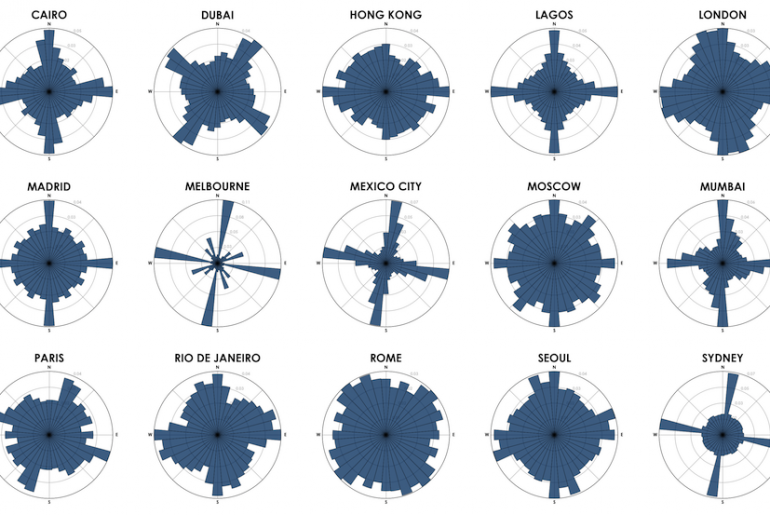
In Chicago or Beijing, any given street is likely to take you north, south, east, or west. But good luck following the compass in Rome or Boston, where streets grew up organically and seemingly twist and and turn at random.
Geoff Boeing calls this structure the “logic” of a city, and he would know: An urban planning scholar at the University of California, Berkeley, Boeing developed a tool to let anyone visualize this urban logic in seconds.
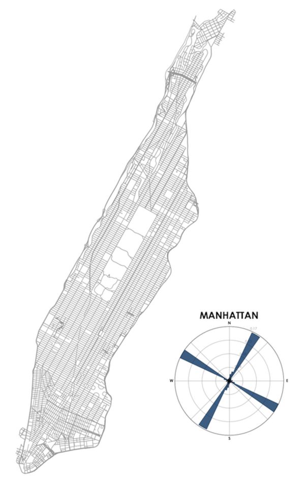
It works by using an old geography technique: the “polar” or circular chart. Boeing’s tool calculates what percentage of a city’s roads run along each section of a compass, and plots it on a circular bar chart. The island of Manhattan, for example, runs from south-southwest to north-northeast, and most of its streets are parallel or perpendicular to the island in a regular grid. Boeing’s program visualizes that as four long bars, with several shorter bars representing the borough’s minority of streets that don’t line up with the grid, as illustrated in the circular pattern below.
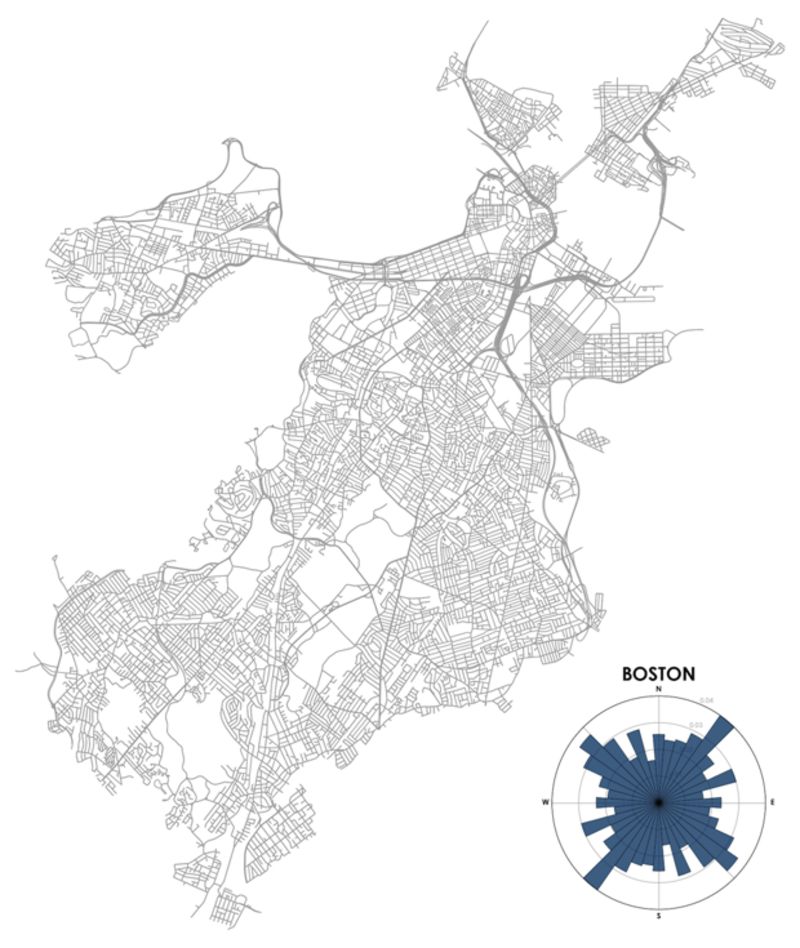
Boston, in contrast, has streets running in every direction. Rather than four bars, its plot is practically a circle:
“These street networks organize all the human activity and circulation in the city,” said Boeing. “I think these visuals can help make otherwise dry or technical city planning concepts more salient and approachable for laypersons. You can easily see and comprehend your own city and how it relates to others’ patterns.”
Visualizing city streets in a circular chart isn’t an original idea. Among others, data scientist Seth Kadish produced similar maps a few years ago. Where Boeing innovated is by releasing a free tool using the popular Python programming language to let anyone with just a little bit of programming skill create a similar map of any city.
“One of my main goals is to empower other people without a Ph.D. in city planning or a strong background in computer science to explore their own cities and discover their own patterns and relationships,” Boeing said.
In fact, now you don’t even need to know basic programming to visualize your city’s street layout like this. Another developer, Vladimir Agafonkin, was inspired by Boeing to create a fully interactive version that works in a browser window.
“Technologies have come such a long way!” said Agafonkin, a software engineer at Mapbox who created the popular Leaflet mapping software. “Today, a default browser on a mobile phone can crunch through data faster than a computing cluster a decade ago, and we have tools to do this in a few lines of code.”
It took him less than half an hour to create a working prototype, and a few more hours to create a polished, public version. Anyone can use a typical web mapping interface to visit any city or other region in the world and see a polar chart of its street grid.
“It’s a wonderful way to explore how cities are built; understand their hidden patterns and influences,” said Agafonkin. “You can see where a road network was meticulously planned and where it grew naturally. [You can] see subtle connections like terrain, water bodies and nearby attractions influencing the direction of roads.”


No comments